
How to Choose Wedding Reception Colours That Feel Effortless
Choosing the perfect color palette for your wedding reception involves more than matching flowers to table linen. Colour influences the mood of the room, the appearance of photographs, the way guests move through the space and even how formal or relaxed the celebration feels. A considered palette can make a large venue feel intimate while giving every visual detail a clear sense of purpose.
Australian couples often draw inspiration from their surroundings. Soft coastal blues suit a Sydney or Brisbane celebration, while terracotta, gum-leaf green and warm sandstone tones feel natural for a celebration influenced by Melbourne, Adelaide or the outback. Seasonal conditions matter too: summer light is strong, outdoor colours can appear brighter, and spring florals may suggest a different direction from winter greenery.
The local wedding market also rewards flexibility. Many couples combine professional styling with personal details, such as handmade stationery, family heirlooms or native flowers. If the reception is being held overseas, a versatile palette can help Australian guests feel connected to home while still complementing the character of the destination.
At Pearl Grand Banana Tree in Sahibabad, Ghaziabad, colour decisions can be adapted across weddings, receptions and pre-wedding ceremonies. The venue’s spacious setting, vegetarian multi-cuisine catering, décor arrangements and hospitality team provide a practical foundation for building a cohesive celebration, whether the guest list is intimate or large.
Begin With The Feeling You Want
Start with the atmosphere rather than a specific shade. Ask whether the reception should feel romantic, contemporary, festive, elegant or relaxed. Champagne, ivory and dusty rose create a softer setting, while cobalt, fuchsia and saffron bring energy to a lively Indian wedding. Olive, terracotta and cream can give the room an earthy, modern character.
Choose one dominant colour, one supporting shade and one or two accents. The dominant colour might appear in draping or larger floral arrangements, the supporting shade in table linen and stationery, and the accent in candles, napkins or signage. This hierarchy prevents the room from looking visually crowded.
It is also useful to consider the wedding’s cultural details. Gold may connect beautifully with traditional jewellery and festive décor, while maroon, turmeric yellow or rich emerald can reflect Indian ceremony traditions without requiring every item to be brightly coloured. Neutral foundations make bolder ceremonial tones easier to balance.
Match The Palette To The Venue
Examine the venue’s permanent features before ordering anything. Floors, ceilings, wall finishes, chandeliers and existing furniture all become part of the colour scheme. At a banquet venue such as Pearl Grand Banana Tree, larger spaces may need deeper accents or layered lighting to avoid feeling empty, while excessive decoration can make a full room feel compressed.
Create a simple visual board with photographs of the hall, fabric samples, floral references and examples of table settings. View these materials together rather than judging each item separately. A colour that looks delicate on a phone screen may appear intense under warm indoor lighting or against patterned décor.
Guest comfort should guide practical decisions as well. Clear walkways, readable menus and visible table numbers are more important than matching every surface. If older relatives or guests with low vision are attending, ensure there is enough contrast between tableware, linen and signage. Thoughtful colour choices can support accessibility as well as style.
Use Light As Part Of The Design
Natural light changes throughout the day, particularly in Australian cities where bright summer sun can affect outdoor ceremonies and portrait sessions. A pale palette may look luminous in daylight but disappear under evening lighting. Deep colours can photograph beautifully after sunset, yet appear heavy in a room with limited natural light.
Think about how the palette will look in photographs from preparation through to dancing. Warm white lighting flatters blush, peach and gold, while cooler lighting can make beige or lavender appear grey. Ask the décor team about uplights, pendant fixtures and candle placement before finalising your colour choices.
Photography locations can also influence the palette. Couples drawn to warm, atmospheric portraits may find inspiration in these golden-hour photo locations, then translate that glow into amber candles, honey-toned fabric or soft apricot florals. The aim is not to copy a photograph, but to identify the light and emotional quality that appeals to you.
Balance Seasonal And Regional Inspiration
Australian seasonal references can create a personal visual language. Native foliage, banksia, wattle, gum leaves and dried grasses offer texture and a connection to home, even when the reception takes place in Ghaziabad. These elements can be paired with locally suitable flowers and traditional Indian décor for a design that feels individual rather than imported wholesale.
For a summer celebration, consider ivory, coral, leafy green or pale blue, while autumn may suit rust, plum and muted gold. Winter receptions can carry charcoal, burgundy, cream and candlelight, and spring works well with lilac, butter yellow or fresh green. Seasonal choices may also affect availability and pricing in the local floral market.
If guests are travelling from Sydney, Melbourne, Perth or another Australian city, keep comfort in mind when selecting fabrics and styling density. Lightweight visual elements, shaded outdoor areas and clear information about the event schedule are helpful for travellers adjusting to a different climate and setting.
Coordinate The Details Without Matching Everything
A polished reception does not require every item to be identical. Repetition is more effective than uniformity: use the same accent colour in the bouquet ribbon, place cards, cake flowers and lounge cushions, then vary textures and neutral tones around it. This creates connection without making the room feel manufactured.
Consider how the palette appears on menus, invitations, welcome signs, seating charts and digital announcements. Consistent typography and colour treatment make even simple stationery feel intentional. Metallic accents should be selected carefully; brushed gold feels warmer and softer than highly reflective silver, while copper can add depth to terracotta or blush.
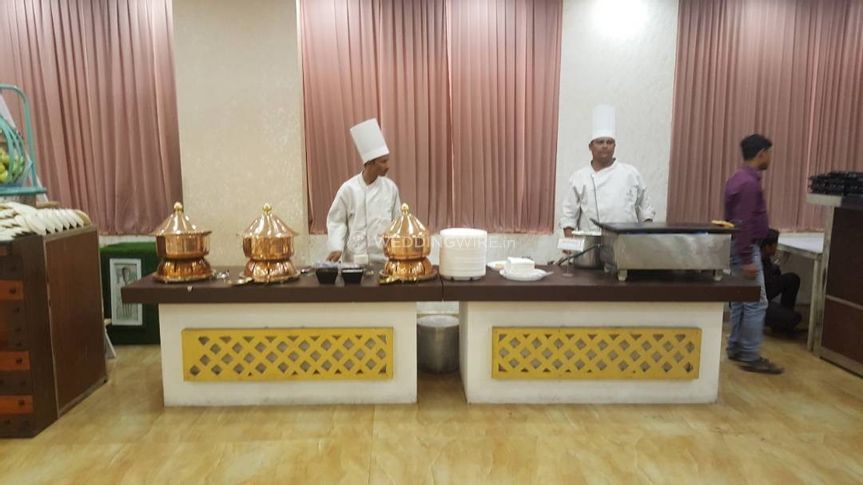
For a banquet with multiple food stations or a broad vegetarian menu, avoid placing strong colours directly beside busy food displays. Neutral table coverings allow the catering to look fresh and appetising. Pearl Grand Banana Tree’s multi-cuisine offering can remain visually inviting when decorative colours frame the dining areas rather than compete with them.
A Practical Palette Checklist
Before approving the final design, view the proposed colours in the actual reception setting and under the lighting planned for the evening. Request small fabric or paper samples where possible, and photograph them together. Screens vary considerably, so printed references are more reliable for making close colour decisions.
Australian couples organising an overseas celebration should also clarify what the venue supplies and what must be sourced locally. Confirm décor lead times, floral availability, setup hours, power requirements and any restrictions affecting candles, hanging installations or amplified music. In Australia, venue planning commonly includes attention to liquor licensing, food safety obligations, accessibility and local noise rules; equivalent requirements should be checked with the destination venue and suppliers.
- Select one main colour, one supporting shade and one accent
- Test the palette in daylight and evening lighting
- Match the design to the venue’s floors, walls and existing furniture
- Use contrast for table numbers, menus and important signs
- Include seasonal or regional details without overcrowding the room
- Confirm décor, catering and setup requirements with the venue team
Review The Palette In The Full Event Context
Look at the colours alongside the wedding attire, ceremony décor, bridesmaid dresses and floral arrangements. A palette that works beautifully in the reception hall may clash with heavily embellished clothing or a brightly coloured mandap. Taking photographs of fabric swatches beside outfit samples can reveal conflicts before deposits are paid.
A successful scheme should also remain comfortable as the celebration changes pace. Soft neutrals may suit the meal and speeches, while richer lighting and stronger accents can bring energy to the dance floor. This layered approach allows one palette to support different moments rather than forcing the entire event into a single visual mood.
Finish by writing down the approved colours, finishes and materials in a shared document for the decorator, florist, stationer, photographer and venue coordinator. Include colour names, sample images and clear notes such as “matte ivory” or “deep olive” instead of relying on vague descriptions. The practical takeaway is simple: choose a mood first, test the colours in the real venue and repeat a few deliberate accents throughout the reception.
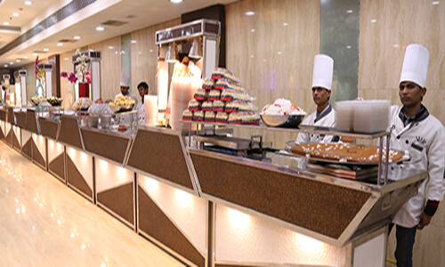
We have a specialized team of highly trained and experienced managers all from 5 stars, captains and other staff and they look after all of the needs of the guests. Our staff is dedicated, polite, courteous, neat and honest
Spacious Elevators and escalated staircase is installed for convenience of our guests. All halls come with Bridle Room with lock for security of belongings of guest. Special Bar Counters

We are serving delicious snacks, some of them have been developed by our expert chefs, and they are our gift to the food industry. We serve full quantity of snacks from start till end of the function.
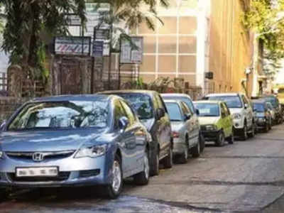
We provide ´Valet Parking´ facility at no extra cost to you. The cars of our guests shall be parked by our expert Valet parking drivers.

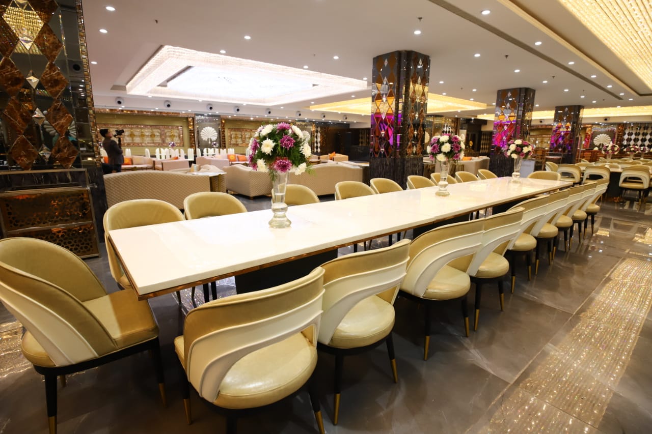
The richness of the ambience can be felt from the Cascading waterfalls, ornamental crystal chandeliers, beautiful Italian marble, light emitting onyx stone and ornate wood work. We have halls large enough to hold parties of 80 to 5000 guests. Beauty of our halls is unmatched in whole of East Delhi.
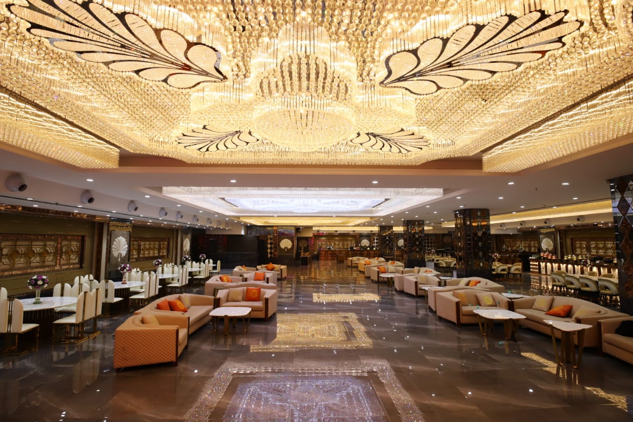
Our Banquet Halls are centrally Air-Conditioned. We run our AC on generators and hence it never stops and it is very effective in the middle of summer too.